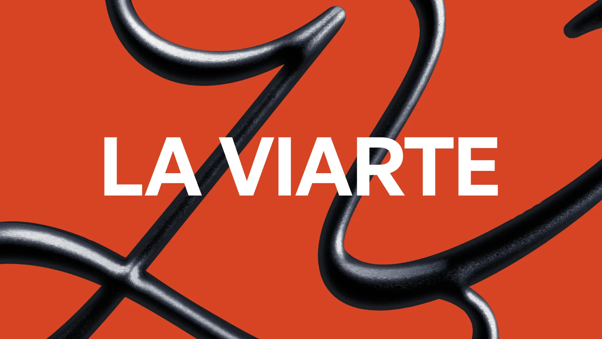
La Viarte — Identity
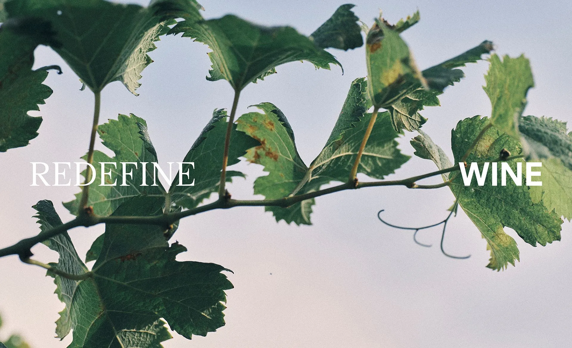
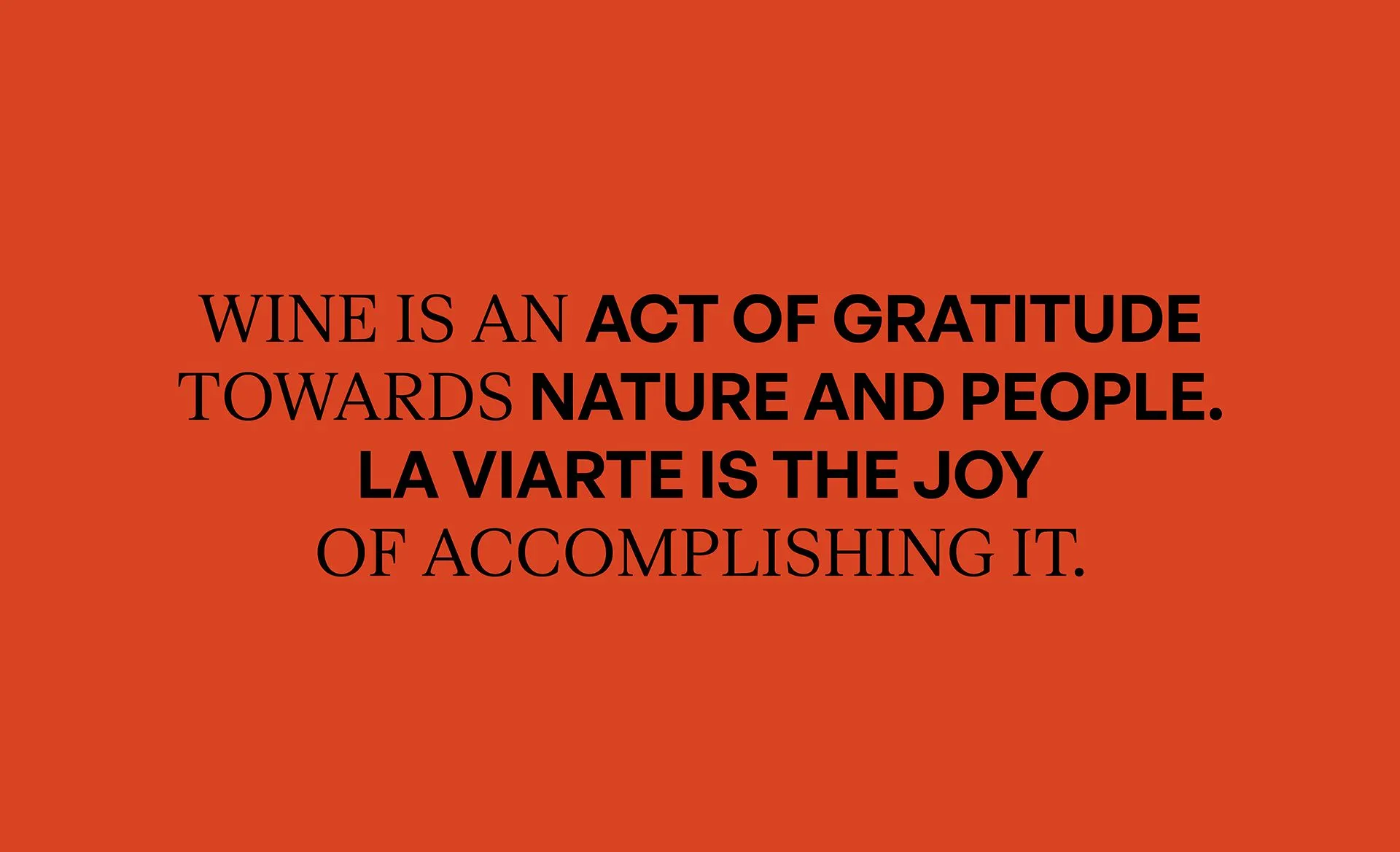
At La Viarte, wine is a gateway to new worlds, reflecting our decades-old vineyards and commitment to innovation. We celebrate our land's bounty, learning from its lessons and embracing tradition as we redefine wine.
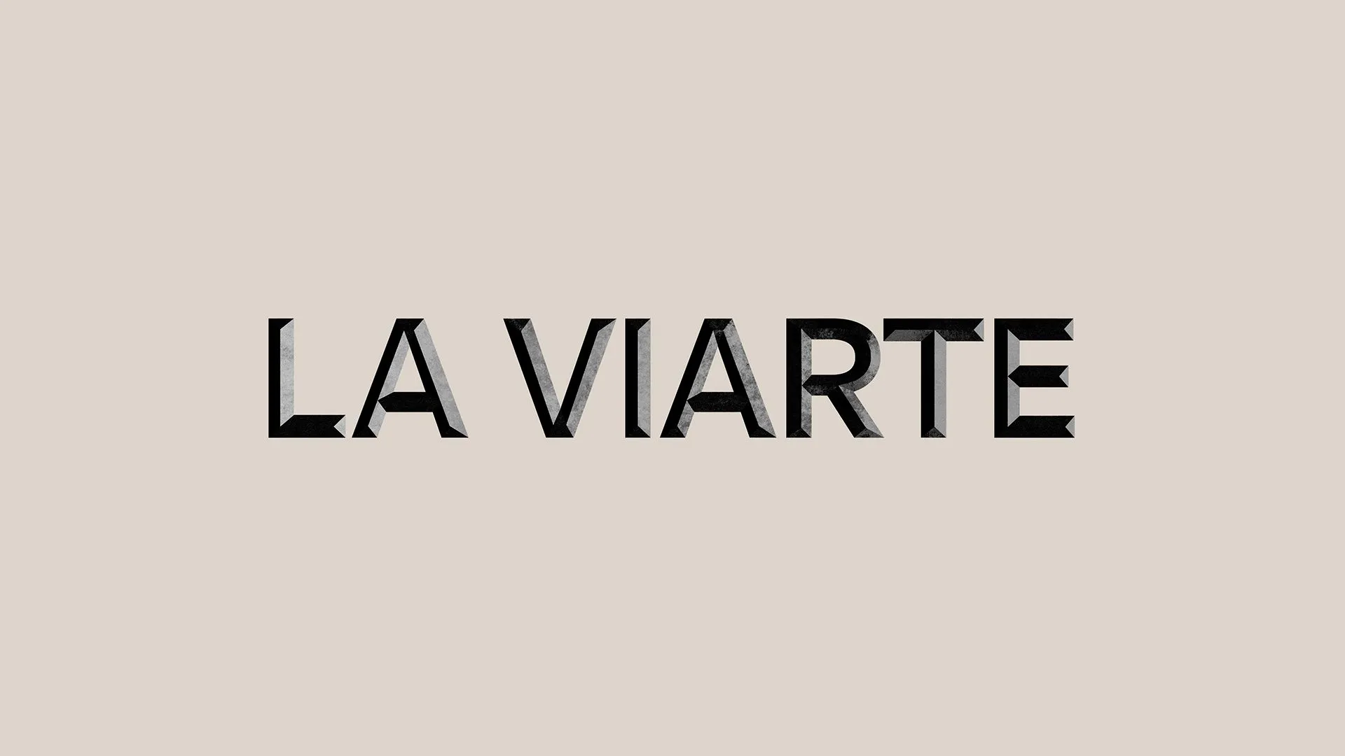
La Viarte, once in shadows, underwent a comprehensive revitalization. We redesigned everything, from logo to labels, infusing each interaction with wonder and authenticity. Our goal was to reignite pride and purpose in the community, reshaping La Viarte from its core outward.
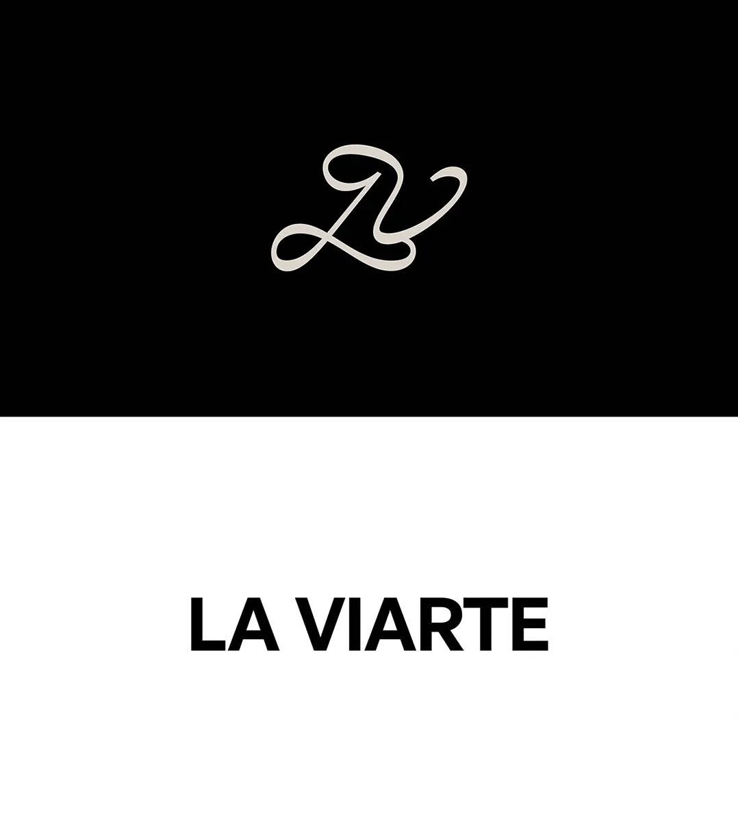
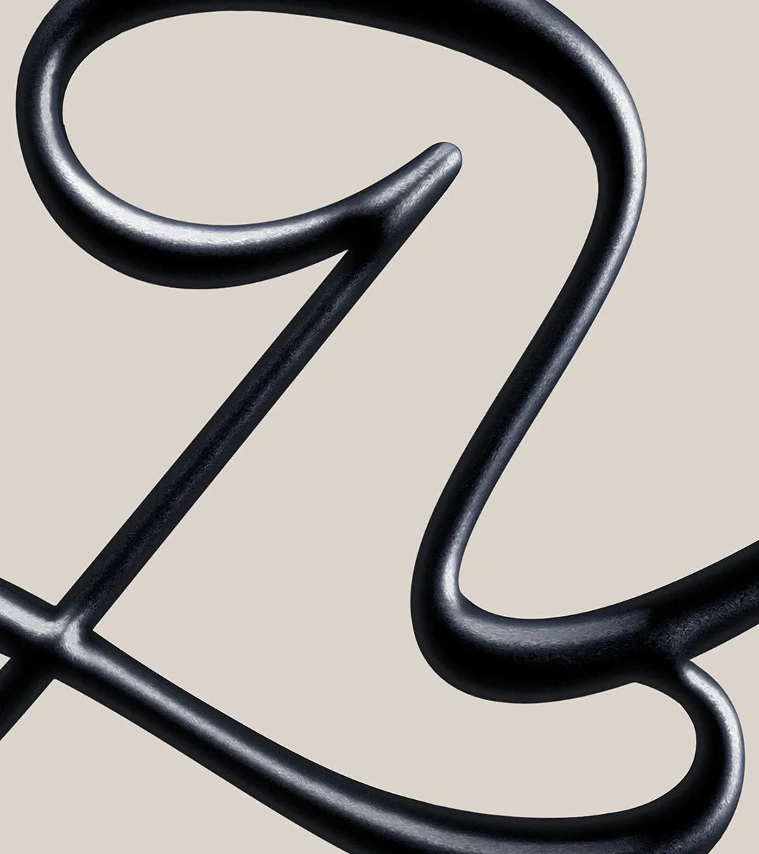
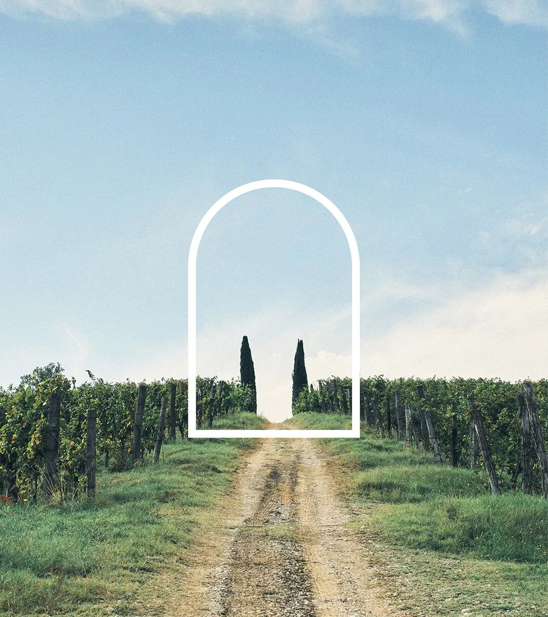
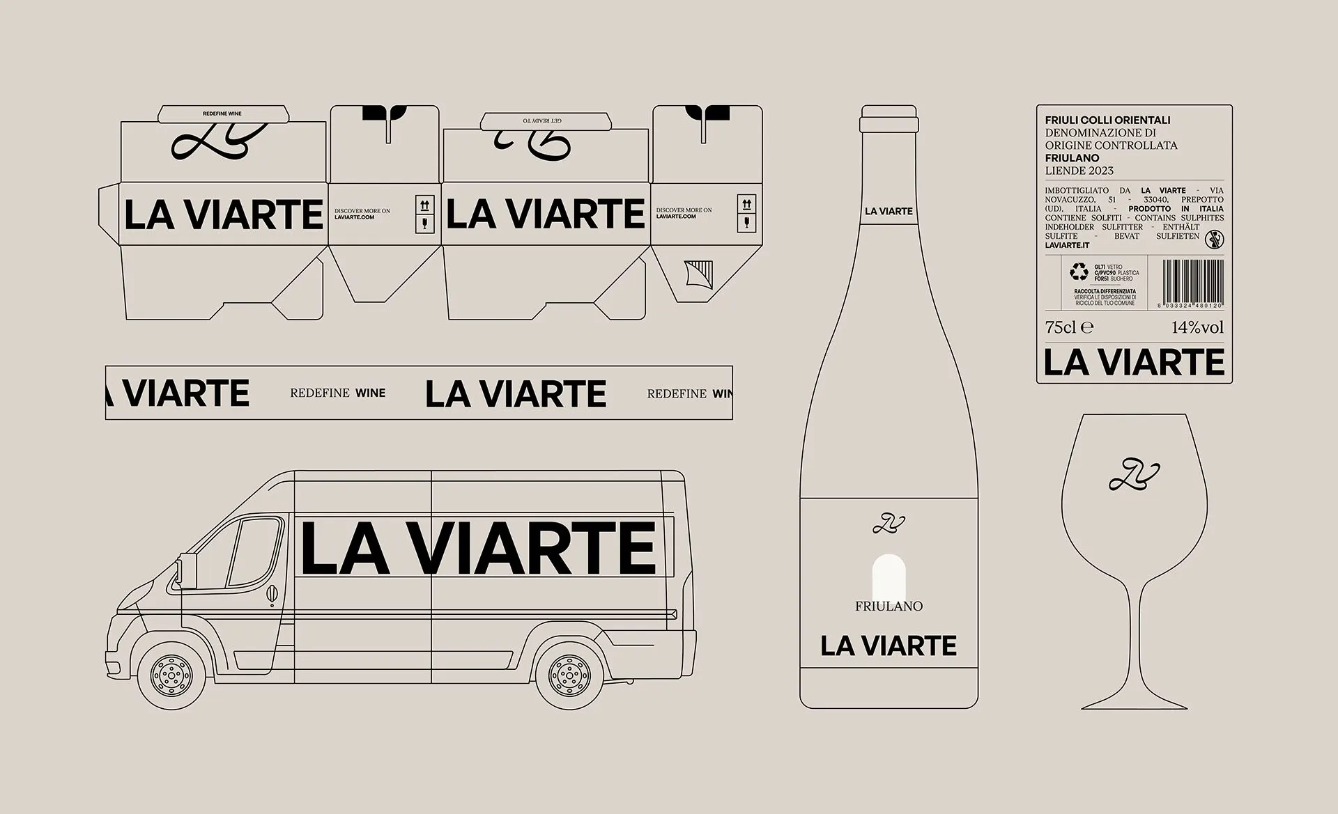
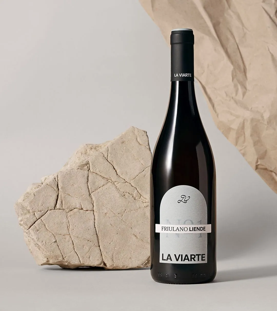
With the new tagline "Redefine Wine," we embarked on a journey to completely redefine the company's image and break free from the communication norms shared by other businesses in the same territory. La Viarte now boasts its own monogram: a hyper-recognizable, elegant, and original symbol capable of becoming an icon and a graphic element. The monogram is eclectic and shape-shifting, interacting with its surrounding environment and photographic material, while the logotype remains solid and bold. The wines, treated as a numbered collection, communicate themselves through vibrant colors, always evoking the world of creativity. Finally, "the door, the arch" serves as a tool to open up to the world and be seen through.
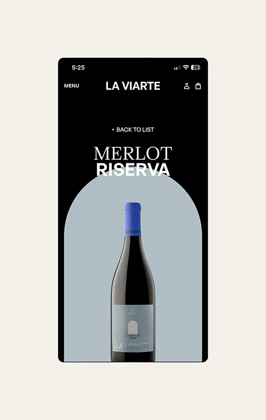
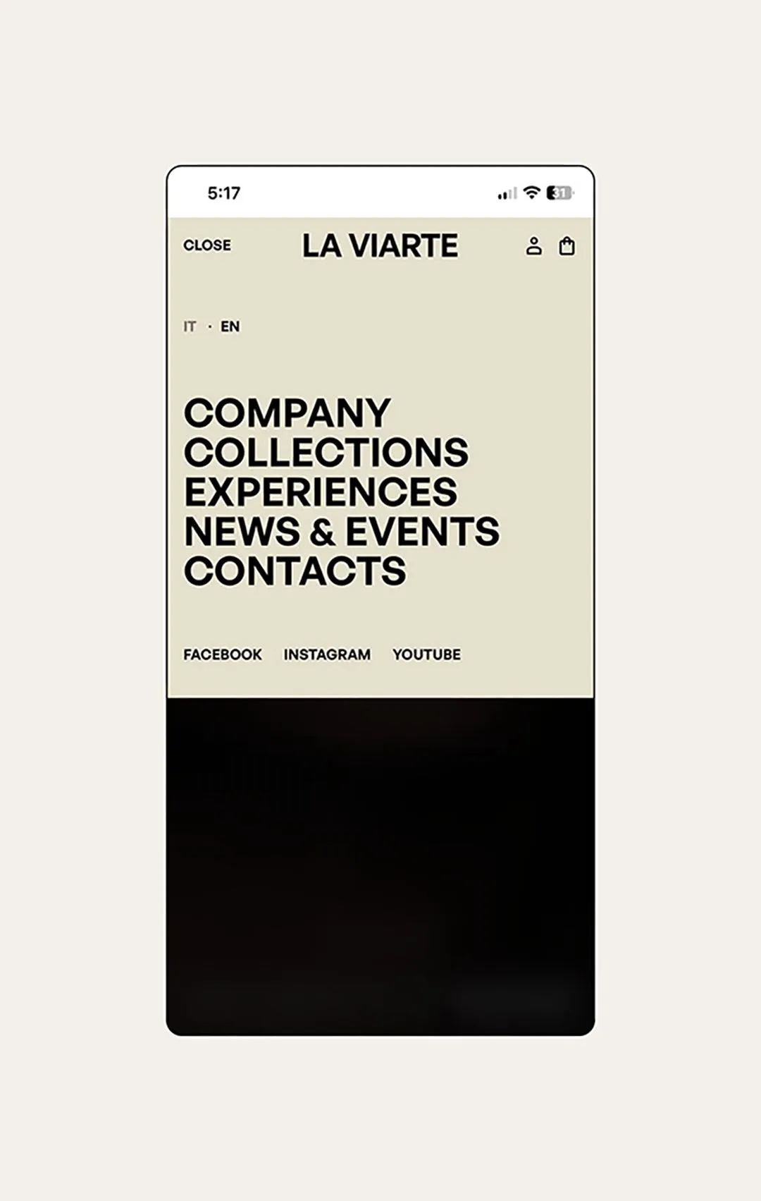
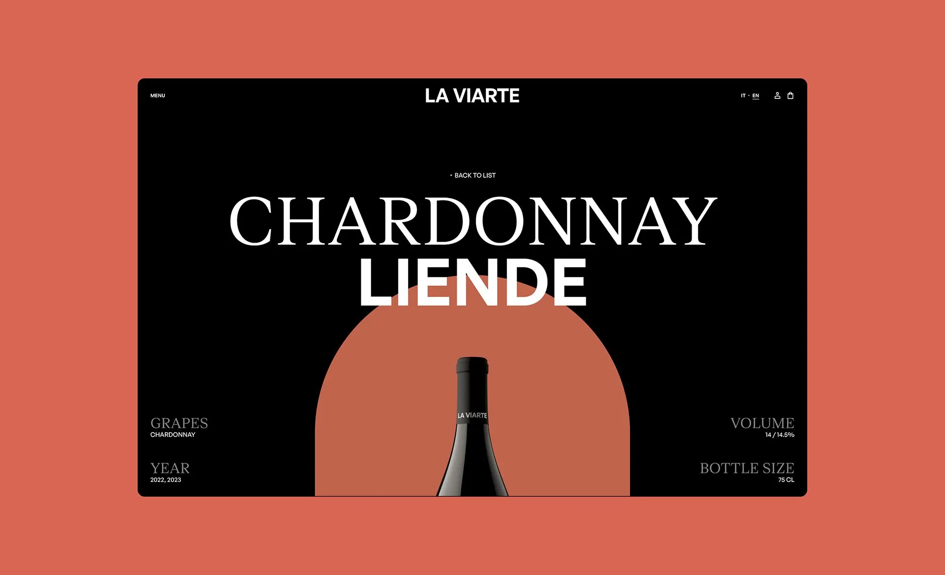
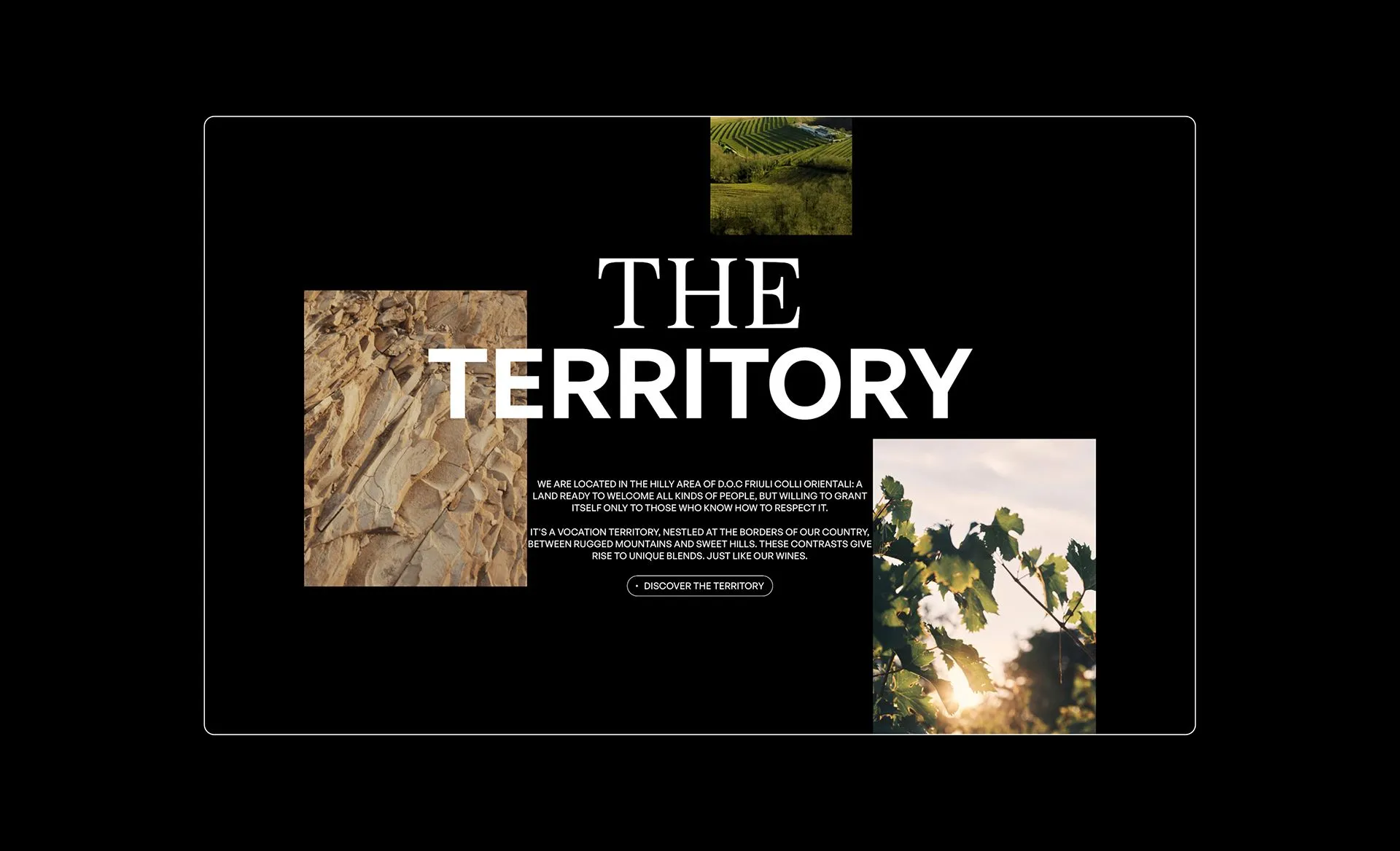
The website is a very important asset in La Viarte's communication. Together with Tango Design, we have created a completely new e-commerce platform focused entirely on colors, shapes, and typography. A platform where the company, its territory and the wines are depicted through a sleek and impactful graphic layout.
- Creative DirectionPaolo Vendramini
- Art Direction & Graphic DesignAndrea Flemma
- Brand Strategy and Creative CopywritingTania Loschi
- Production CompanyIppocampoStudio
- Director & DOPAndrea Pugiotto
- Web StudioTango Design